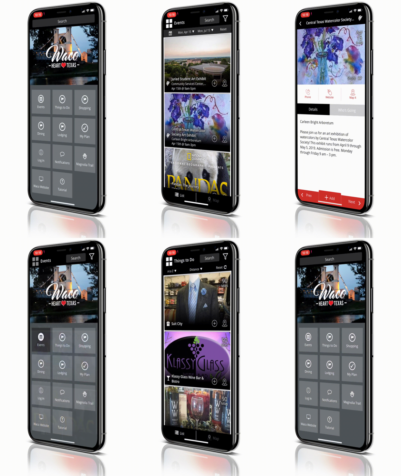
GRID MENU HOME SCREEN
Gone are the days of conventional tree structure navigation

Gone are the days of conventional tree structure navigation; endlessly drilling down through lists of categories until you eventually find what you were looking for, only to have to navigate back through the same amount of clicks to return to the main menu… so frustrating! Visit Widget apps are strategically designed to provide a familiar UX/UI that mimics some of the most popular apps designs, while eliminating the need for end users to relearn a new navigation structure. When you launch a Visit Widget app, you are immediately presented with rich content and the ability to select interests to filter items more granularly, on the list or map view. Further, the infinite list format provides an easily scrollable image rich view instead of simple text based listings, giving people a better perspective of each attraction, event or tour. Users can browse the default list or open up the left side partial pane menu to access other content types.
Based on client requests, we are excited to announce an all new navigation UI option within the mobile apps. If you want more than 6 primary menu items and want that “Full Home Screen” feeling when people first open the app, you are in luck! We are excited to announce the all new Full Screen Grid Menu. When enabled, the Full Screen Grid Menu acts as a default landing page in the app, allowing people to select between menu items in a grid menu to access the list views. It also provides a space for a beautiful hero image, and Search remains globally accessible; on the home screen as well as within each list view. For more information about enabling this feature, reach out to your account manager or click here to contact us.


